At A Glance
The Passport of George Pepperdine

PALEOGRAPHY
George Pepperdine was an active writer throughout his many journeys. From all across the world we have documented literature from Pepperdine himself. From Egypt to Hawaii and many documents written in the United States, we are able to see many forms of Pepperdine’s writings. There is controversy within some of his writings. Specifically, handwriting throughout the editing process of some of his works. As the paleographer, it is my goal to focus on the pure handwriting of George Pepperdine. The best example of Pepperdine’s handwriting that provides a vast amount of examples and content of emotion is the journal that he kept on his trip to Hawaii in 1924.
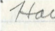
Diving right into the analysis of Pepperdine’s hand writing, I do notice that throughout his work, there are some inconsistencies. His ‘H’ for example is founds written two different ways frequently. On multiples occasions, I find that the ‘H’ in capitol for is flowed into with a brief stroke leading to the first vertical column. This creates for a powerful capitol H in his handwriting. Yet, there are examples of his powerful ‘H’ being found without this unique characteristic. The conclusion I draw when looking around at the words around this letter comes down to one hypothesis. Analyzing the cursive around the two different forms of ‘H’, I have interpreted that when Pepperdine makes his leading stroke into the H, it seems as if he is taking time with his journals. On the other end, when he leaves the leading stoke out of the ‘H’, the handwriting around it is a bit faster and sloppy if you will.
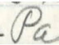
Often Pepperdine will not connect the starting vertical of his letters, bellow is a third example of an ‘H’ where you can see this trend. Although the break in connection is not unique to the ‘H’, it adds to the diversity among specific letter written by Pepperdine. It is also common to find this lack of connecting marks with lowercase s’s and both forms of A’s.
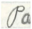
Moving on as I continue to analyze Pepperdine’s handwriting, there is one letter I find often that catches my eye. The letter ‘P’ is arguably Pepperdine’s most beautiful letter when it comes to his handwriting. Similar to the ‘H’, there are differences in the way he writes the letter. Describing the beautiful letter when capitalized is as so: In one unlikely way, Pepperdine’s letter ‘P’ is drawn as one line as the pencil never leaves the paper. Spacing between the lines make this letter unique and beautiful as if it belongs on today's Philadelphia Phillies baseball jerseys.
Examining the two distinction I found, one looks as if it was written years before. One shows maturity and care. Oddly enough, these two distinctions are held on the same page in the two examples below.